!
!
!
!!! The SDK 1.0 is deprecated and no longer supported. We recommend using the latest version of the SDK. If you have any questions or need assistance, please contact us.
!
!
!
If you are starting from scratch:
yarn command to install all dependenciesTo update, bump the patchkit_* entries in the package.json file to their latest version.
package.json file).yarn run-theme-dev command to start the development server.
:::warning
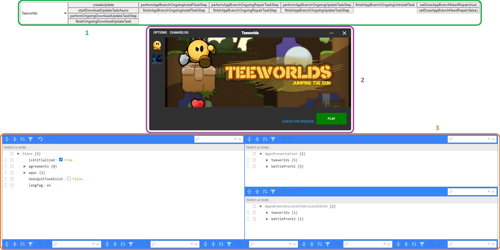
Simulated actions do not terminate automatically. When you trigger an action in the launcher, such as clicking the INSTALL button, you may think it has crashed. You have to terminate it manually using buttons (e.g., finishAppBranchOngoingInstallTaskStep).
:::
:::warning
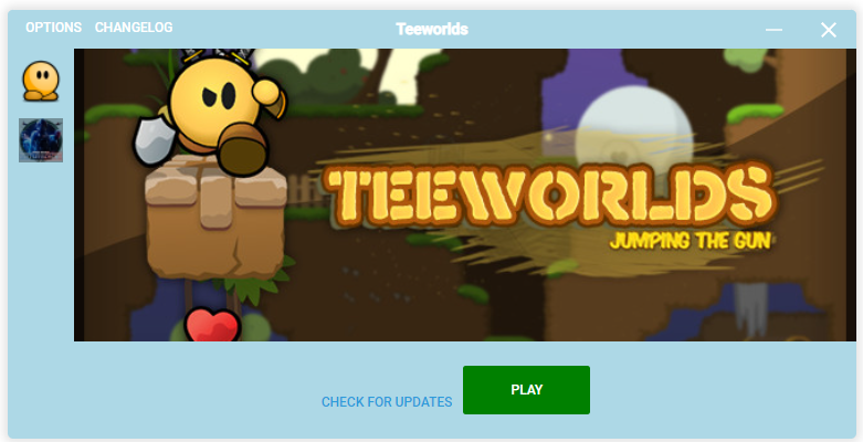
By default, the theme is set to the not initialized state. This is the state where the launcher theme is being displayed to the user, but the launcher still needs some time to load all the required data. Feel free to customize this view and switch to the initialized state by setting State > isInitialized to true in the data editor.
:::
You can modify the theme by editing files in the src directory using your favorite code editor. The included example theme is based on React, and all React rules apply here.
:::info You can build launcher themes on any technology, not just React. :::
:::info
In the example, all components are styled inline, and there are no external stylesheets. However, you can use external stylesheets freely if you prefer! You might need to update the scripts/core/_get_app_webpack_config.ts file.
:::
In our React example, we use camel-case notation for styling, and non-numeric values must be enclosed in quotation marks (``, ‘’, “”).
Example:
style={{
  height: `100%`,
  flexBasis: `60px`,
  flexGrow: 0,
  flexShrink: 0,
  paddingLeft: `10px`,

  overflow: `auto`,
{{
  height: `100%`,
  flexBasis: `60px`,
  flexGrow: 0,
  flexShrink: 0,
  paddingLeft: `10px`,

  overflow: `auto`,
{% end %}
}}
For more complex styling, you can import the emotion package:
import emotion = require('emotion');
This allows you to use standard CSS styling with the className attribute:
className={emotion.css`
  &::-webkit-scrollbar {
    width: 5px;
  }

  &::-webkit-scrollbar-thumb {
    border-radius: 50px;
    background-color: #dedede;
  }
`}
The main theme file is called window_widget.tsx and can be found in the src directory. For example, if you want to change the overall background color or round the corners, this is the right place to do it.
There are universal components that can be used in different situations, such as:
button_widget.tsxhoverable_html_div_widget.tsxlabel_button_widget.tsxlabel_widget.tsxpopup_widget.tsxThese components are used in various places with slightly modified variations. Be cautious when making changes to these components, as it can lead to unpredictable behavior of other components that rely on them.
All components containing app_branch in their name are backend-related components. Modify those only if you are sure that it will not break the launcher functionality.
:::info We recommend using version control systems (VCS) like Git and committing your code frequently. This way, you can track any breaking changes more easily. :::
To change the main background color, modify the window_widget.tsx file:
88. backgroundColor: `lightblue`,
The top bar retains its original color. To change it, modify the window_title_bar_widget.tsx file:
43. backgroundColor: `lightblue`,
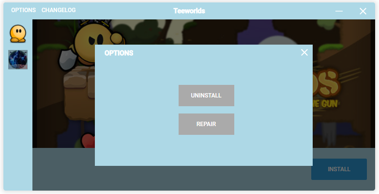
To change the popup background color, modify the popup_widget.tsx file:
48. backgroundColor: `lightblue`,
In the app_branch_widget.tsx file, add centering style to the parent div of the AppBranchStateWidget component:
91. display: `flex`,
92. justifyContent: `center`,
The code should look like this:
{% raw %}
<div
  style={{
    width: `100%`,
    flexBasis: 0,
    flexGrow: 1,
    flexShrink: 0,
    display: `flex`,
    justifyContent: `center`,
  }}
>
  <AppBranchStateWidget
    appId={appId}
    appBranchId={appBranchId}
    appPresentation={appPresentation}
  />
</div>
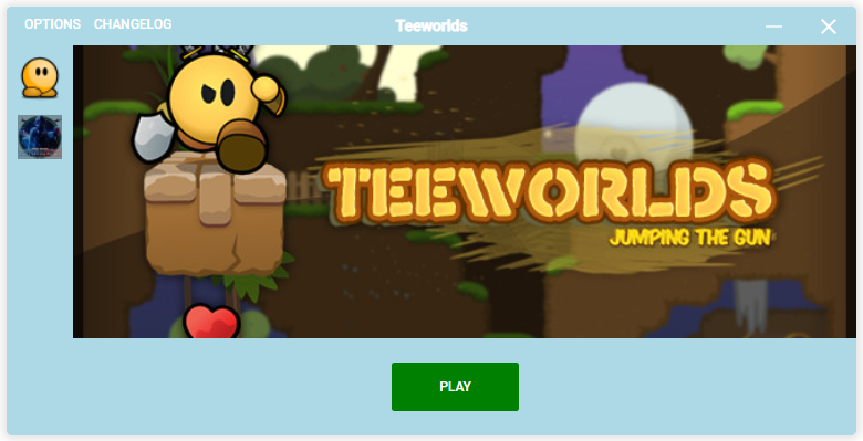
Change the isVisible flag to false in the start_app_branch_widget.tsx file:
68. checkForUpdatesButtonWidget={{
69.   isVisible: false,
70. }}
In the window_widget.tsx file, around the line 126, there is a component responsible for displaying application icons in the left menu. Its children iteratively return the icon of each application. To add the application name next to its icon, you can use the appState object.
<div
    style={{
      width: `40px`,
      height: `40px`,
      marginTop: `10px`,

      cursor: `pointer`,

      backgroundImage: `url(${appState.iconImageUrl})`,
      backgroundSize: `contain`,
      backgroundRepeat: `no-repeat`,
    }}
    onClick={() => {
      setCurrentAppId({ currentAppId: appId });
    }}
    >{[
    currentAppId === appId
      ? undefined
      : <div
        style={{
          width: `100%`,
          height: `100%`,
          backgroundColor: `#00000055`,
        }}
      />,
    ]}

</div>
For simplification, I will use the icon code as <AppIcon /> in future examples.
To get information about the application name, we can use the appState object.
You should change: (pseudocode)
<AppIcon />
into:
<div>
    <AppIcon />
    <div>{appState.name}</div>
</div>
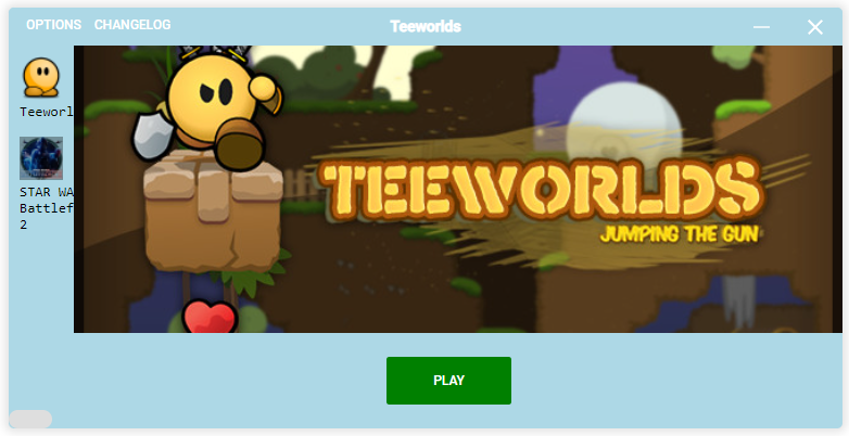
The text is too wide and cannot fit inside the bar. To fix this issue, apply some styling:
flexBasis value to widen the entire bar.
<div
    style={{
        display: `flex`,
        alignItems: `center`,
        cursor: `pointer`,
    }}
>
    <AppIcon />
    <div
        style={{
            width: `100%`,
            paddingLeft: `10px`,
        }}
    >{appState.name}</div>
</div>
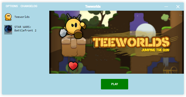
The text will not respond to clicks because the onClick action is only attached to the icon. To include the text, move the onClick action up a level:
<div
    style={{
        display: `flex`,
        alignItems: `center`,
        cursor: `pointer`,
    }}
    onClick={() => {
      setCurrentAppId({ currentAppId: appId });
    }}
>
    <AppIcon />
    <div
        style={{
            width: `100%`,
            paddingLeft: `10px`,
        }}
    >{appState.name}</div>
</div>
The deployment process is currently in beta and some of its elements may be different than described. If you encounter any issues, please contact us.
To deploy your custom launcher theme, you need to build the launcher theme and upload it to your dashboard. You can build your theme by executing the following command:
yarn build-theme-prod
This will create a theme_prod folder in the root directory of your project. You should zip the contents of this folder and upload it to your dashboard. You can learn how to do this by navigating to the Launcher Themes Managament page.
Yes, you can use any front-end framework or library, or even build your launcher theme from scratch. The example provided uses React, but you’re not limited to using React.
You can add custom logic by modifying the relevant components in the SDK, such as the app_branch_widget.tsx file. Implement the desired logic within the component and make sure the launcher functionality isn’t affected.
Yes, you can use external stylesheets or CSS modules. To include them, you might need to update the scripts/core/_get_app_webpack_config.ts file to properly load and apply the styles.
Yes, you can use a different bundler if you prefer. However, you will need to configure it correctly to work with the Electron Launcher SDK and ensure compatibility with all dependencies.
If you encounter an issue or bug, first ensure that you have the latest version of the SDK. If the issue persists, consult the documentation and relevant online resources. If you still cannot resolve the issue, consider contacting the SDK support team for assistance.
Since the launcher is built on the Chromium web engine, it should work consistently across different operating systems and devices that support Chromium. However, to ensure compatibility and optimal user experience, it’s recommended to test your custom theme on various devices and operating systems.
To deploy your custom launcher theme, you need to build the launcher theme and upload it to your dashboard. Please refer to the Deploying section for more information.